


“It's like coming across a clearing in the jungle.”
Those are the words used by data journalist David McCandless when discussing the value and effect of data visualizations in a 2010 TED Talk.
In a world where it’s easy to feel that we’re “all suffering from information overload or data glut,” McCandless added, visualizations offer a cleaner, leaner alternative to the more dull-and-dense aesthetic offered by traditional data representations.
Given their aforementioned features and digital media’s relentless pursuit of new mediums and ways to build loyal audiences, bright and shiny data visualizations are practically ubiquitous today — so much so that some might consider them to be a 21st-century phenomenon.
Of course, a little digging shows that this isn’t exactly the case. While the colors may be a bit more vivid and the devices on which we view the visualizations entirely new, the fact is that people have altered the physical form of data to convey a more streamlined, visually impactful message for centuries.
For instance, statistician Hans Rosling traces the dawn of the infographic back to Florence Nightingale, the 19th-century nurse and statistician who revolutionized army and civilian healthcare.
And, you guessed it, Nightingale used data visualizations to make her case: In 1856, as Rosling notes, Nightingale argued for healthcare reform via a series of pie charts, which she believed would "affect thro' the eyes what we fail to convey to the public through their word-proof ears.”
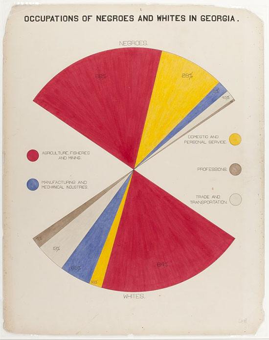
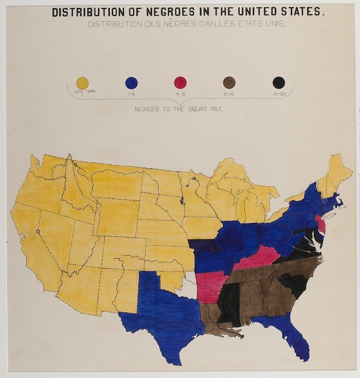
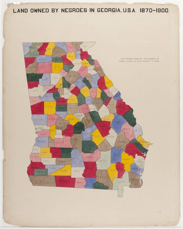
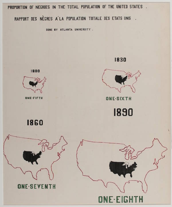
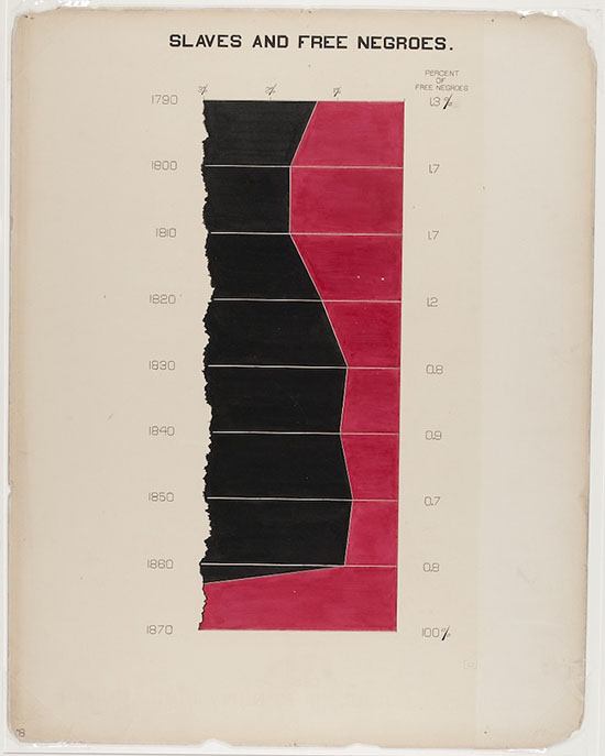
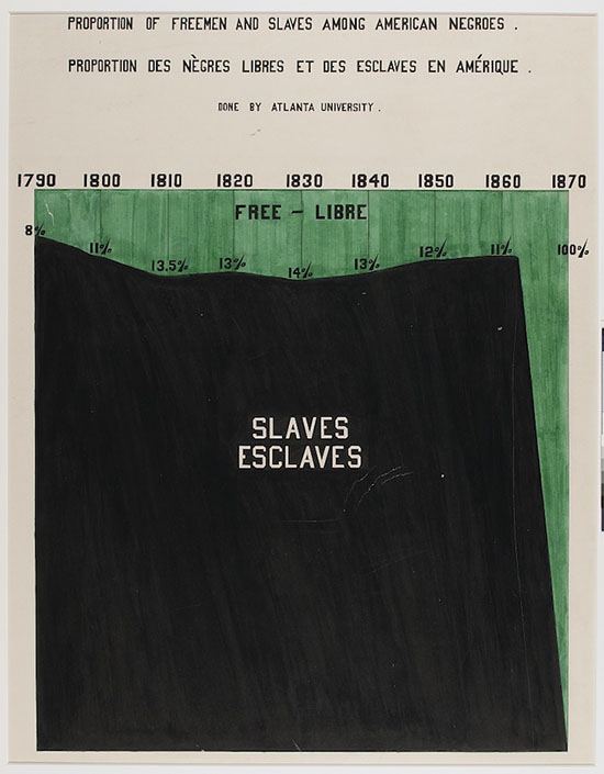
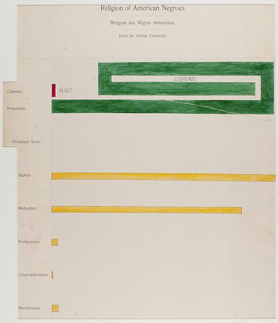
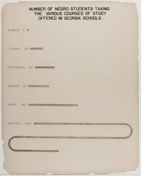
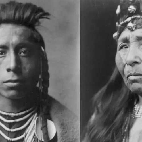
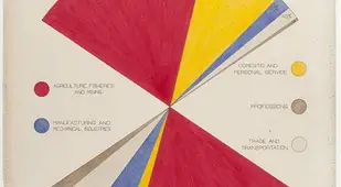
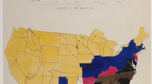
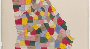
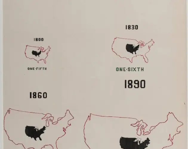
But perhaps one of the most significant, if not underappreciated, early examples of data visualization comes from none other than W.E.B. DuBois. Indeed, in 1900, the African-American sociologist presented “The American Negro at Paris,” a series of 32 charts, 500 photographs, and dozens of maps to capture the history and present of African-Americans in the United States — all of which were, DuBois would write, “planned and executed by negroes, and collected and installed under the direction of a negro special agent.”
Before the exposition, DuBois had devoted himself to collecting evidence on the everyday affairs of African-Americans in the U.S. in order to, as the Library of Congress notes, combat racism — specifically the “the claims of biological race scientists influential at the time, which proposed that African-Americans were inherently inferior to Anglo-Americans.”
By using data to demonstrate the economic and cultural diversity of the African-American population, DuBois hoped to do away with what he called “conventional American ideas” about African-Americans.
The infographics and charts DuBois and his black peers made would, in his eyes, play a critical role in shattering stale, racist ideas about African-Americans in the U.S. “We have thus, it may be seen, an honest, straightforward exhibit of a small nation of people, picturing their life and development without apology or gloss, and above all made by themselves,” DuBois wrote of the exhibit.
But it wasn’t just the process of visualizing the data that mattered to DuBois; it’s what that data communicated to a broader audience.
“When the inevitable question arises, ‘What are these guided groups doing for themselves?’ there is in the whole building no more encouraging answer than that given by the American negroes, who are here shown to be studying, examining, and thinking of their own progress and prospects.”
Next, check out these maps that will change the way you think about the United States. Then, have a look at 33 more maps that explain America better than any textbook.