Most people believe that maps show the "truth" of the physical world. But how much are we really getting wrong?
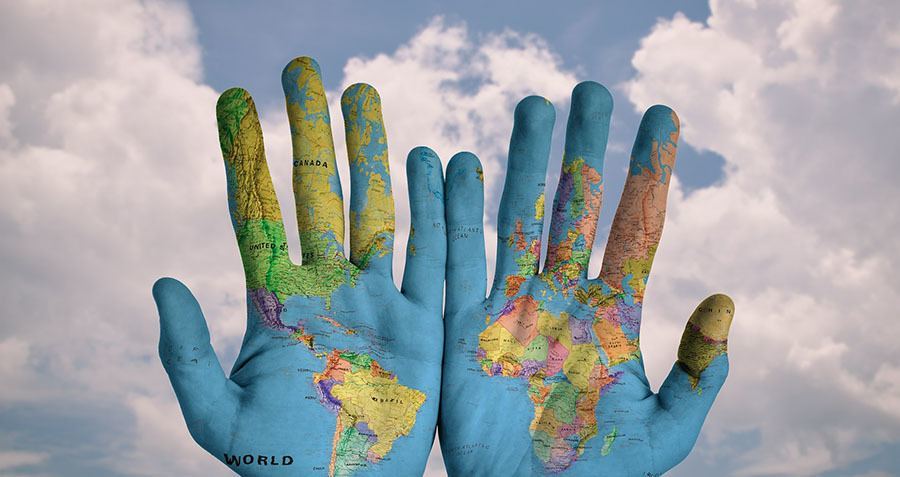
Image Source: Pixabay
March 9th marks the birth of Amerigo Vespucci, the Italian cartographer and explorer whose life’s work (and surname) contributed to the naming of North and South America.
In addition to that noteworthy entry on his resumé, Vespucci was also the first person to demonstrate that Brazil was not necessarily east of Asia, but a whole “new world” — or at least that’s what he thought he saw upon arriving at Rio de la Plata and Rio de Janeiro at the turn of the 16th century.
As Vespucci’s assertions make clear, people tend to believe that what they see is the truth — and the same holds for maps. But when we look at a map of the world, we are looking at a flat projection of Earth, a sphere, which means that some distortion is inevitable.
In many cases, we don’t take that into account, undoubtedly skewing our perceptions of the planet, which can shape what – or where – we value. Let’s take a look at what maps get wrong, and how they affect our understanding of the world.
1. Mercator’s Representation Of Africa, Or The “Greenland Problem”
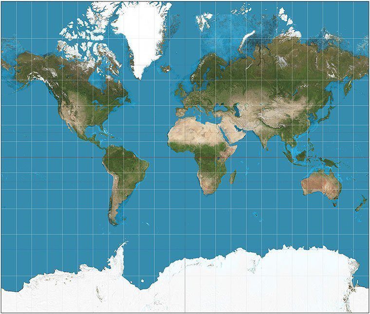
An example of the Mercator Projection. Image Source: Wikipedia
The most commonly used representation of Earth is the UTM, or Universal Transversal Mercator conformal projection, named after Flemish cartographer and geographer Gerardus Mercator.
The UTM map respects a physical space’s shape, but not its actual size, cartographer Miguel Ángel Rodríguez explains. “Mercator is a conformed projection,” he says. “It respects angles and forms, but does not respect distances and areas.
“[Since] it represents a sphere on a rectangular flat map, it can’t be perfect, but that’s the problem that cartography solves with projections,” he adds. “For our daily use, UTM is the most accurate representation of the world. For somebody who sails, somebody who flies, and regular people, we all use different representations of the earth, but for daily use UTM is the best one.”
But this cylindrical representation, which Mercator made in 1569, also generates a lot of debate over what is called the “Greenland problem.” Why does this island of 0.8 million square miles appear to be nearly the same size as Africa, which measures 11.6 million square miles?
Some say that it has to do with the time in which Mercator made his map, and for whom he made it: The cartographer made his map in the 16th century, and for European mariners simply trying to get from A to B by drawing a straight line, it was useful to depict Europe as larger than it actually was.
Others look at Mercator’s skewed sizing as a remnant of colonialism. Our historical perception of the world, especially of developing countries in the Southern Hemisphere, has been heavily influenced by the Mercator representation.
Through disproportionate sizing, critics say that this projection can have the effect of suggesting that some regions — such as Europe — are more important than others, like the African continent.
In 1973, German filmmaker and journalist Arno Peters went so far as to say that the Mercator projection was racist, believing that “this error led many in the developed world to ignore the struggles of the larger, poorer nations near the equator.”