2. The Gall-Peters “Saggy Underwear” Projection
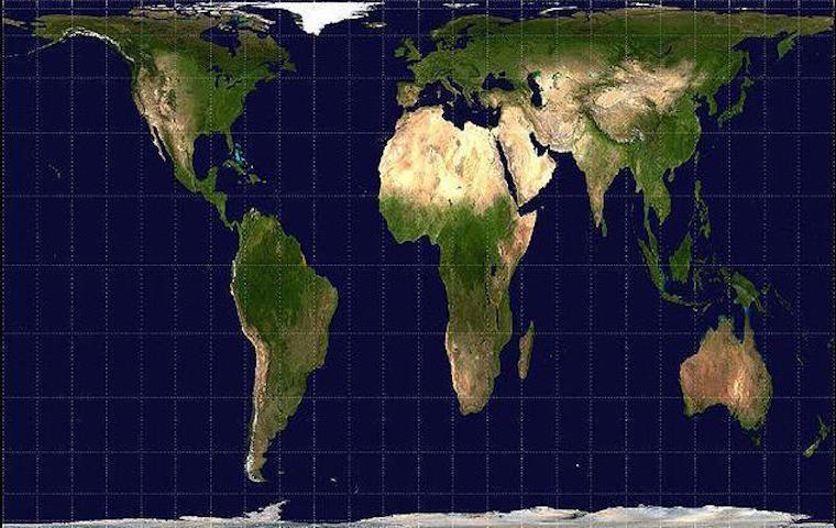
The Gall-Peter Projection or the “saggy underwear.” Source: Wikimedia
Peters presented his own projection in 1974, which he believed solved the problems manifest in the Mercator projection. Cartographers agree that Peters’ projection better portrays the size of Earth’s masses, in particular the fact that the landmass in the Southern Hemisphere is almost double the size of the Northern Hemisphere.
Its biggest flaw? First, there’s the fact that the map had already been invented almost 200 years before by James Gall, and Peters basically claimed it as his own.
For Arthur Robinson (whose projection we will see next), where Mercator’s projection failed by enlarging countries, Peters’ projection is problematic because of stretching — horizontally near the poles, and vertically near the Equator.
Robinson described this stretching as “somewhat reminiscent of wet, ragged, long winter underwear hung out to dry on the Arctic Circle.”
3. The Robinson Cylindrical Projection, Or The Extreme Stretching Of The Poles
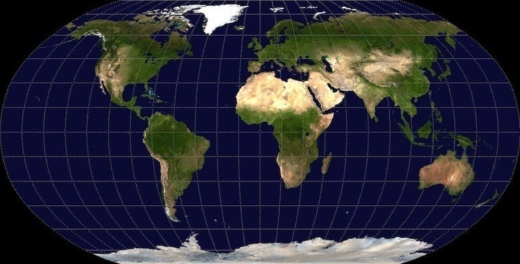
The Robinson Projection. Source: Wikimedia
Created by an American geography professor in the 1960s, this map was seen as the solution for Mercator and Peters’ distortions. The National Geographic Society adopted this projection in 1988, before switching to the Winkle Tripel Projection – we’ll see that next – in 1998. This projection is pseudo-cylindrical, and maintains the integrity of areas and shapes better than the previous two projections.
The issue with this portrayal is that, as much as the equatorial areas are fairly well represented, the poles get the worst end of the deal: They’re stretched out to the corners like rectangular pizza dough.
4. Winkle Tripel Projection: It’s All About Compromise
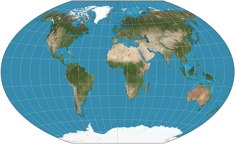
The Winkel Tripel Projection. Source: Wikimedia
Experts say this depiction does the best job of balancing shapes and areas, which might be because this projection is the arithmetic mean of two other projections. It looks a lot like the Robinson projection, but ironically the parallels don’t run in parallel, but rather with a slight curvature.
The name tripel (“triple” in German) comes from its aim to minimize the biggest flaws on other projections: the distortions of area, direction, and distance.
Regardless of which map you call your own, the reality is that the physical truth of the world — as relayed by maps — will always be flawed. While Rodríguez praised the maps as human achievements in mathematics, he adds that, “There is not a perfect projection method. They all distort the reality one way or the other.”
Next, check out the 33 maps that will change your perception of the United States.