The Equal Earth projection hopes to put an end to distorted world maps for good.
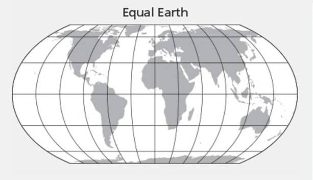
Tom PattersonThe Equal Earth map projection.
An accurate world map is something that has evaded cartographers for centuries. But this new design just might make distorted maps a thing of the past.
In a study released in the International Journal of Geographical Information Science, cartographer Tom Patterson and his colleagues, Bojan Šavrič and Bernhard Jenny, presented a solution to this long-held problem: how to make a map of the world that accurately portrays the size and shape of the Earth’s landmasses.
Whether you’ve realized it or not, all of the maps that you are used to seeing are distorted. The most common map is the Mercator projection map, which was created by Flemish geographer and cartographer Gerardus Mercator in 1569, according to IFLScience.
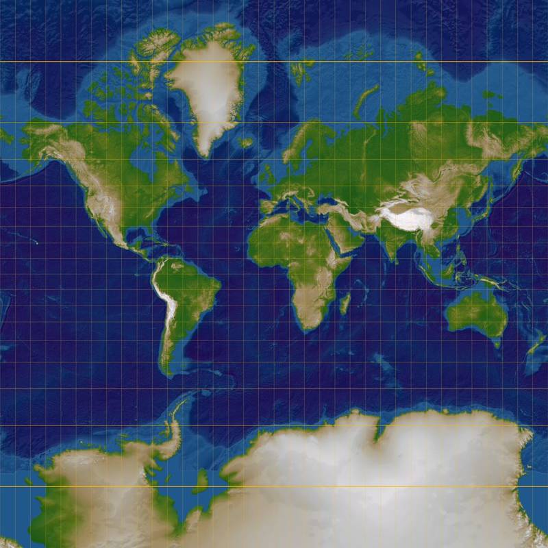
Lars H. Rohwedder/Wikimedia CommonsMercator projection map.
The Mercator projection is good because it preserves the angles and shapes of the world’s continental landmasses well, but it greatly distorts the size of that land. This creates an issue called the “Greenland problem” where landmasses further from the equator like Greenland, appear much larger than the ones that are across it, like Africa.
According to The Economist, Africa is actually 14 times larger than Greenland but if you look at a Mercator projection map, you would think the opposite. In addition to the map’s size problem, several critics of it say that the wide use of Mercator’s system shows a cultural bias.
Arno Peters, a German historian, believed that the Mercator projection was more popular because it made northern European countries larger than their opponents in the southern hemisphere, suggesting that European countries were more powerful.
As a remedy for this bias, Peters proposed that the Gall-Peters projection map be used instead. In 2017, Boston Public Schools became the first school district in the United States to get rid of the Mercator projection in an effort to “decolonize the curriculum in our public schools” and switched to Gall-Peters.
However, this projection was not without its own faults.
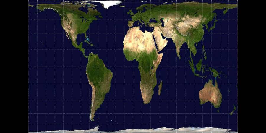
Wikimedia CommonsGall-Peters projection map.
The Gall-Peters accurately depicts the size of the landmasses but distorts the shapes of the continents. It seemed like we were doomed to forever have to choose between either accurate size or accurate shape without the option of having both until Patterson and his team unveiled their Equal Earth map.
According to the study, Patterson, Šavrič, and Jenny searched for alternatives to the equal-area world map projections currently available but “could not find any that met all of our aesthetic criteria” so they decided to create their own.
Their design was inspired by the Robinson projection map from 1963 which even got the seal of approval from the National Geographic Society when they named it their map of choice in 1988, according to IFLScience.
The Robinson map is a partial hybrid between the Mercator and Gall-Peters, taking bits and pieces of each that make it “highly suitable” for world maps according to the study’s authors.
For their Equal Earth map, Tom Patterson’s team drew from the Robinson projection but upgraded one key feature.
“The Equal Earth map projection is inspired by the widely used Robinson projection, but unlike the Robinson projection, retains the relative size of areas.”
This latest map is able to portray both an accurate size and shape of the Earth’s landmasses, thereby resolving the two issues of previous world maps.
The search for an unbiased, well-proportioned world map has befuddled cartographers for centuries but the new Equal Earth projection may finally end the world map catch 22 once and for all.
After learning about the Equal Earth map, check out the AuthaGraph, the most accurate world map you’ll ever see, but you probably won’t like the way it looks. Then see how our ancestors saw the world through these ancient maps that illuminate the distant past.