From the true size of Africa to the countries that refuse to use the metric system, these maps will make you see our world in a whole new light.


And if you liked this post, be sure to check out these popular posts:
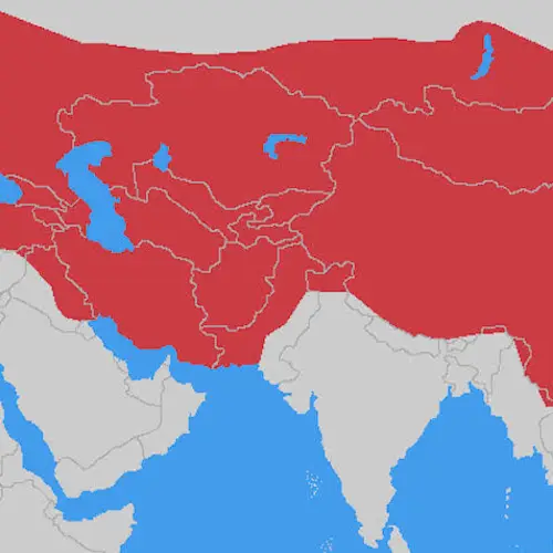
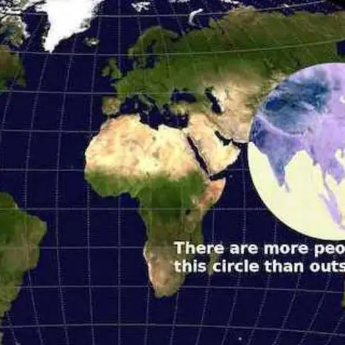
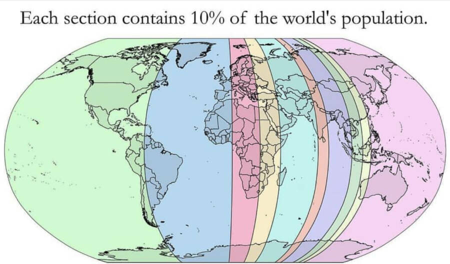
World Population Map
This map shows the surprisingly small region where many of the world's people live.valeripieris/Reddit
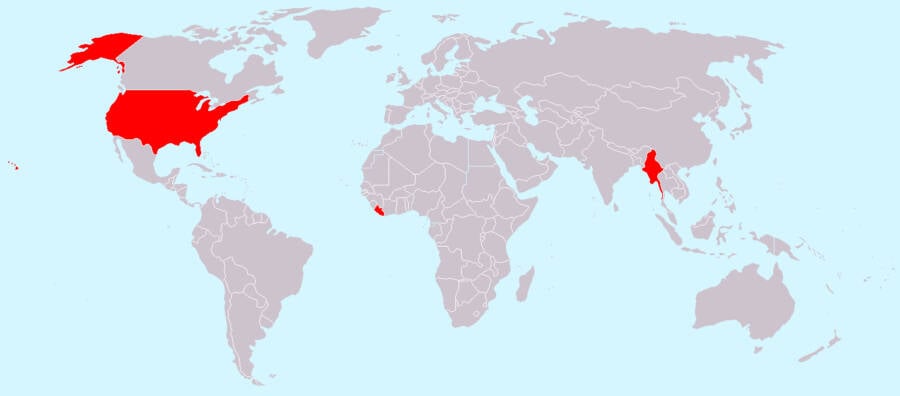
Metric System Vs. Imperial System
Back in 2009, NASA said that converting its engineering plans, software, and hardware to the metric system would cost $370 million — and that's just one agency.Digg
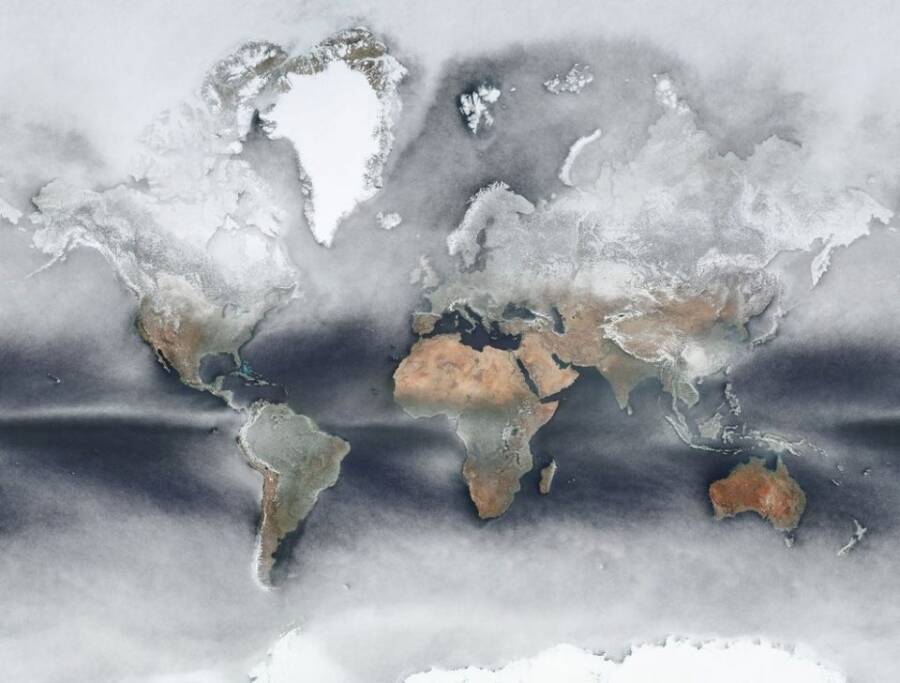
Cloud Cover World Map
This map shows the average cloud cover around the world. At any given time, around two-thirds of the Earth's surface is covered by clouds.Johannes Kroeger
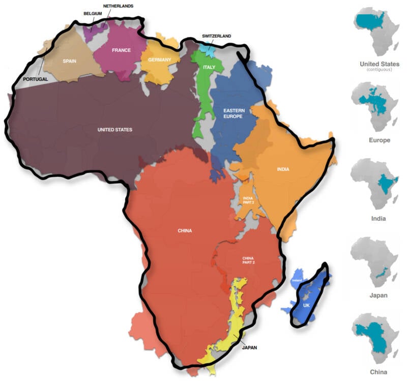
True Size Of Africa Map
In reality, the continent is large enough to fit the contiguous United States, China, India, Japan, and several European countries within its borders.Kai Krause
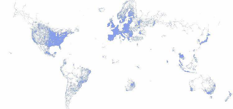
Google Street View Map
This map shows the heavy concentration of Google Street View in Europe and the U.S. By contrast, hardly any streets in Africa (outside of South Africa) appear on Google Street View — and the same goes for much of Asia.Baubauciaociao/Reddit
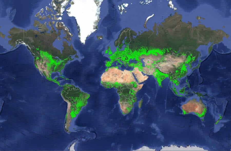
Crop Coverage World Map
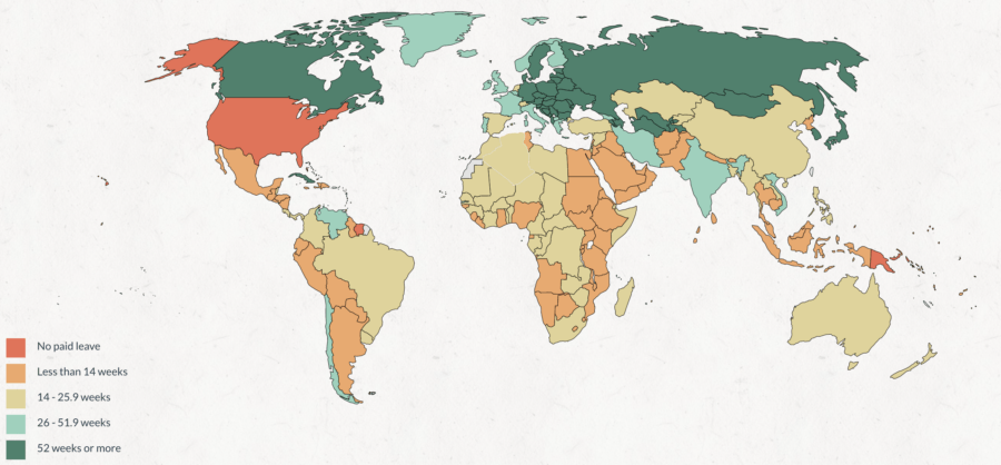
Maternity Leave World Map
Countries in dark green offer a year or more of maternity leave. Those in light green offer 6 to 12 months. Yellow represents 14 to 26 weeks, while light orange shows under 14 weeks. Dark orange represents areas with no guaranteed paid maternity leave.
The U.S. stands out as one of the only countries in the world with no federal paid maternity leave.NPR
New Zealand-Centered World Map
A remote, Southwestern Pacific nation, New Zealand contains two main islands and some 700 smaller islands. This map shows a Kiwi perspective on the globe.MeronDC/Reddit
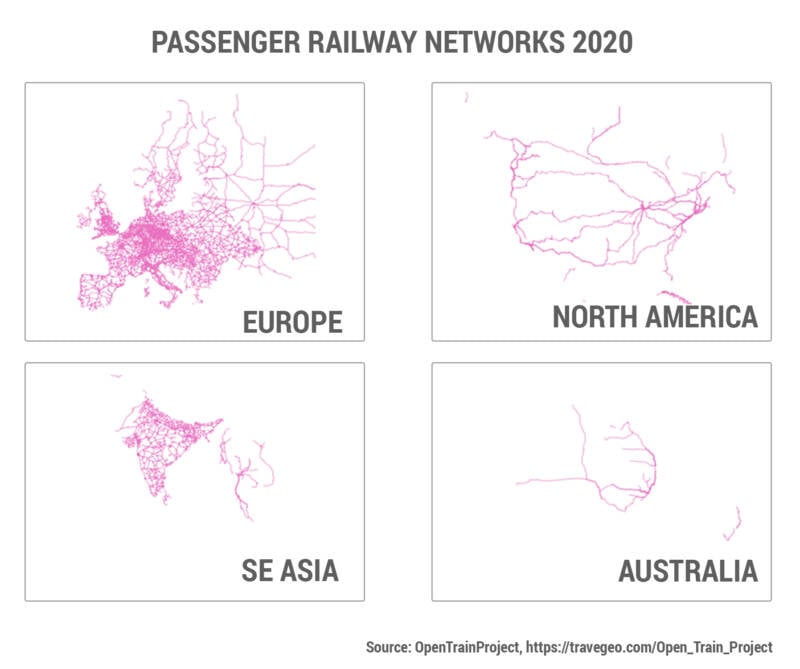
Passenger Railway Networks
In other areas, passenger railway lines are uncommon. This map highlights railway networks in four regions.OpenTrainProject
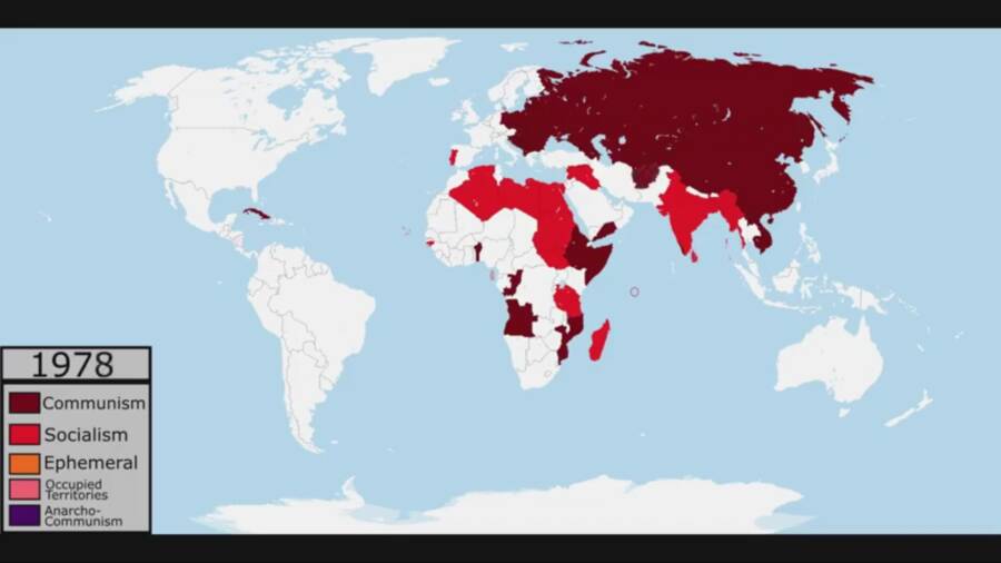
Communist And Socialist Countries In The Late 1970s
This map shows the large number of Communist and socialist countries in 1978. SBG99DesiMonster/Reddit
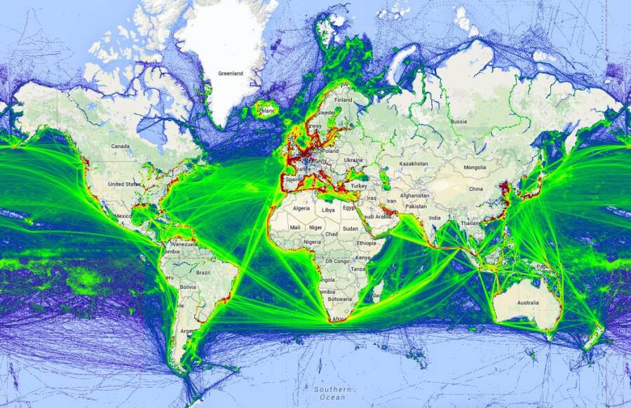
Ship Traffic World Map
Like some other forms of transportation, these ships are a significant source of carbon dioxide emissions. But unlike other methods of transport, the shipping industry is almost completely unregulated — which can lead to massive amounts of pollution.MarineTraffic
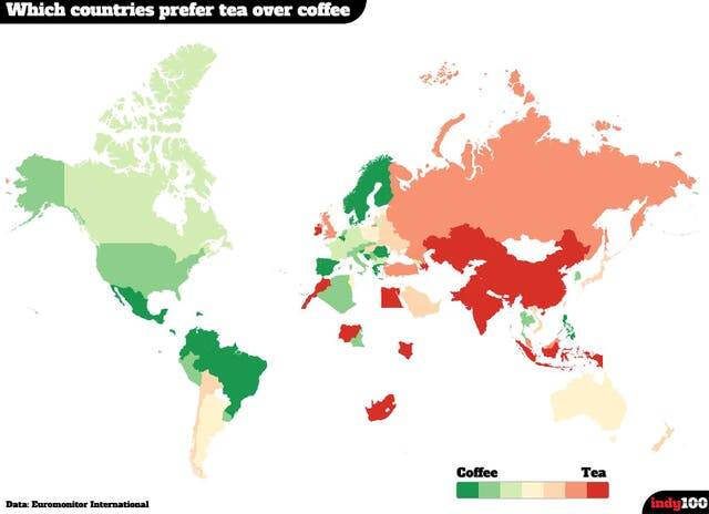
Tea Vs. Coffee World Map
While much of the Western hemisphere sips coffee, most Asian countries strongly prefer tea. In fact, China, India, and Sri Lanka rank as some of the top tea-producing countries in the world. The Economist
Time Zones World Map
Time zones date back to the 1884 International Meridian Conference, which was held in Washington, D.C. However, it took years for all nations to get on board with the idea, and many countries have made changes to their local time zones throughout the centuries.Branden Rishel
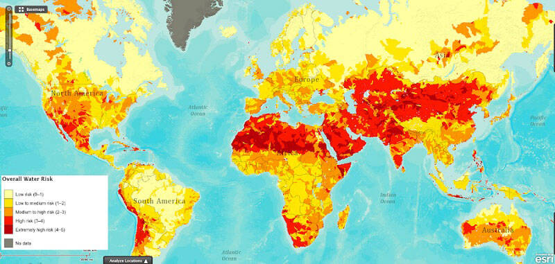
Water Risk World Map
This map shows the overall water risk for different regions of the world, with low-risk areas in light yellow and high-risk areas in dark red.Gassers/World Resource Institute
World Elevations Map
The highest elevation on land is Mount Everest at about 29,000 feet. And the deepest point in the sea — the Challenger Deep — is about 36,000 feet below sea level.Reddit
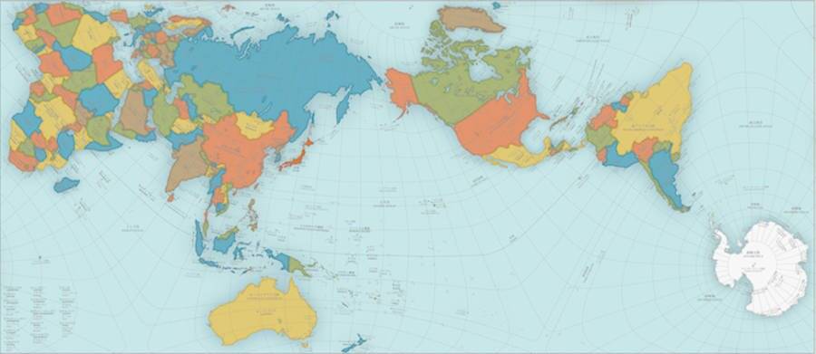
The "Most Accurate" World Map
In response to these wildly inaccurate and misleading maps, a Japanese architect named Hajime Narukawa came up with an innovative solution: triangles. Dividing the spherical surface of the world into 96 triangular regions, Narukawa mapped out those regions on a flat, rectangular surface while still maintaining their original area ratios.
Though the resulting AuthaGraph World Map still isn't perfect, it's said to offer the "most accurate view yet" of what our world actually looks like.AuthaGraph
Global Population Distribution Map
This map divides the globe into 10 wedges, each of which represents 10 percent of the total population.JamesGeo
Map Of The World's Ports
This map shows the location of every port in the world. tusu111/Reddit
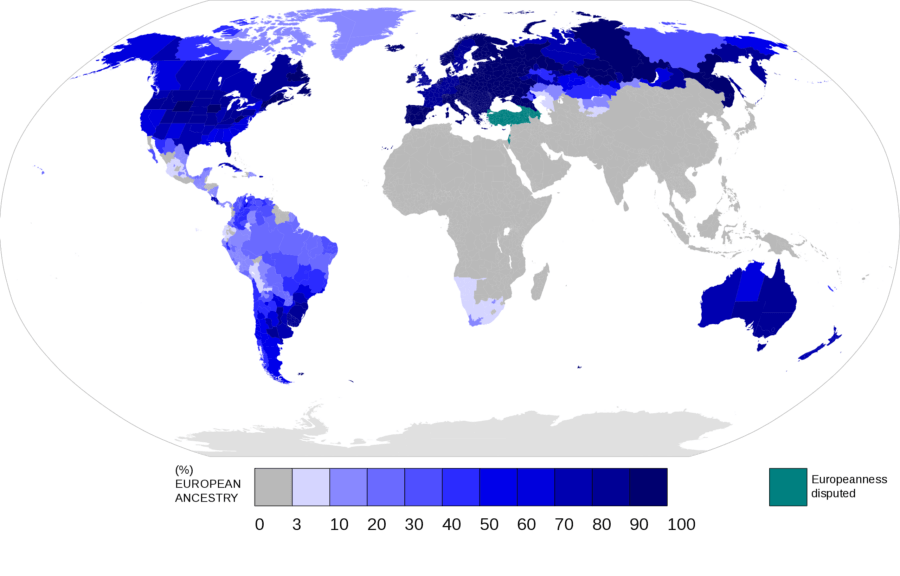
European Ancestry World Map
Unsurprisingly, former European colonies often report high percentages of people with European ancestry, as shown in the darker shades on the map. But Africa — which was heavily colonized by European countries in the 19th and early 20th centuries — represents a major exception. Nagihuin/Wikimedia Commons
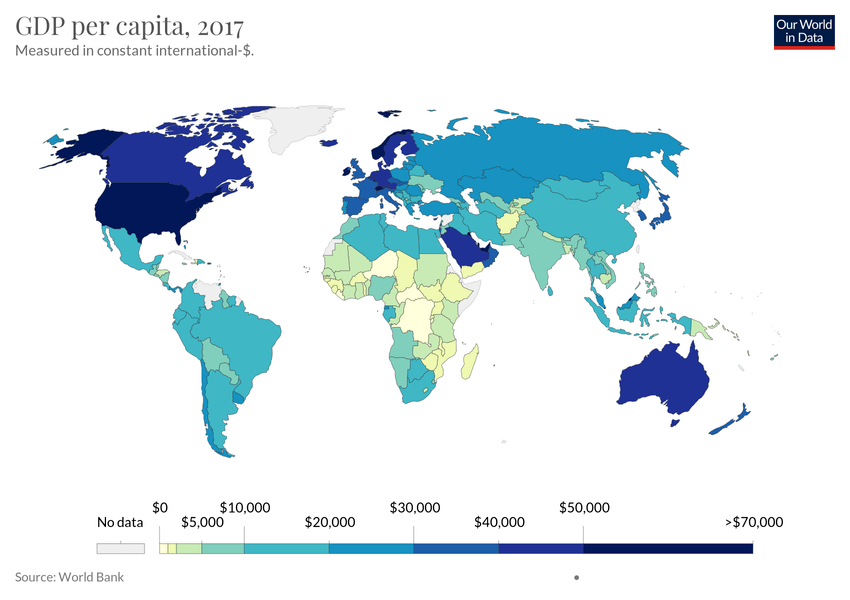
GDP Per Capita World Map
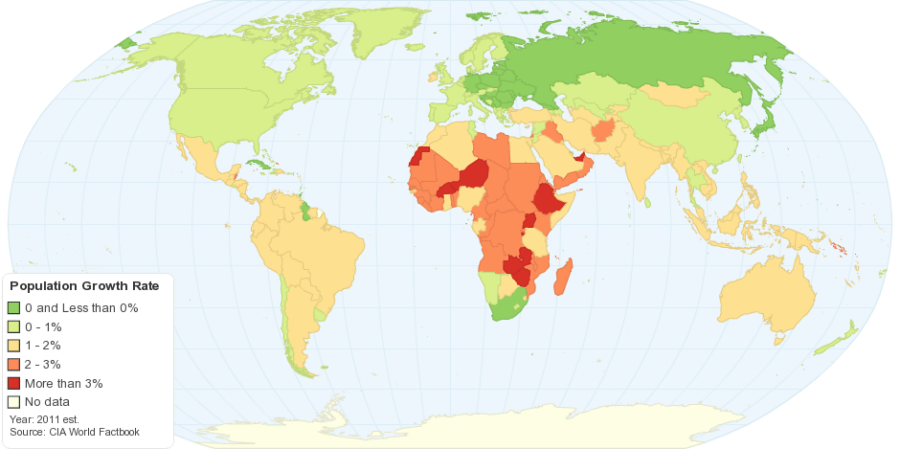
Population Growth World Map
This map breaks down the world by population growth rate. The darkest green countries represent growth rates of zero or below. Meanwhile, light green represents 0-1 percent growth, yellow is 1-2 percent growth, orange is 2-3 percent growth, and red is over 3 percent growth. CIA
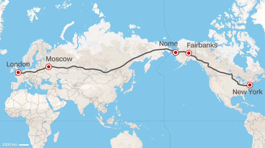
Proposed Trans-Siberian "Superhighway" Map
In 2015, the president of Russian Railways proposed a "superhighway" that would connect North America to Asia and Europe. If this idea ever took off, it would reportedly cost "trillions of dollars" to build and would span almost 13,000 miles.CNN
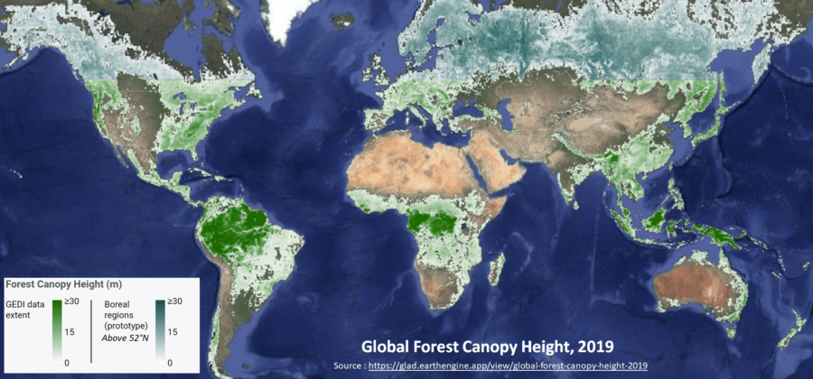
Forest Canopy Height World Map
Forests grow to different heights around the world. As the map shows, equatorial rainforests report some of the highest forest canopies, as do subarctic forests. These forests help absorb carbon dioxide and release oxygen into the atmosphere. They also play a role in biodiversity.Global Forest Watch
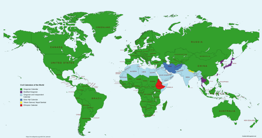
Calendar World Map
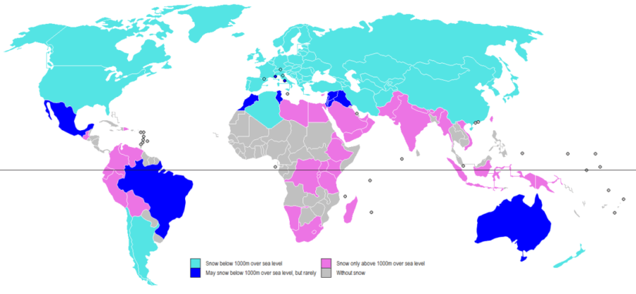
Snow Around The World
According to this map, the light blue countries see snow in places that are below 3,000 feet over sea level, while dark blue countries very rarely see snow at that elevation. Pink represents countries that only see snow in places that are above 3,000 feet over sea level. And the gray countries never receive snow, even in places with high elevation.Wikimedia Commons
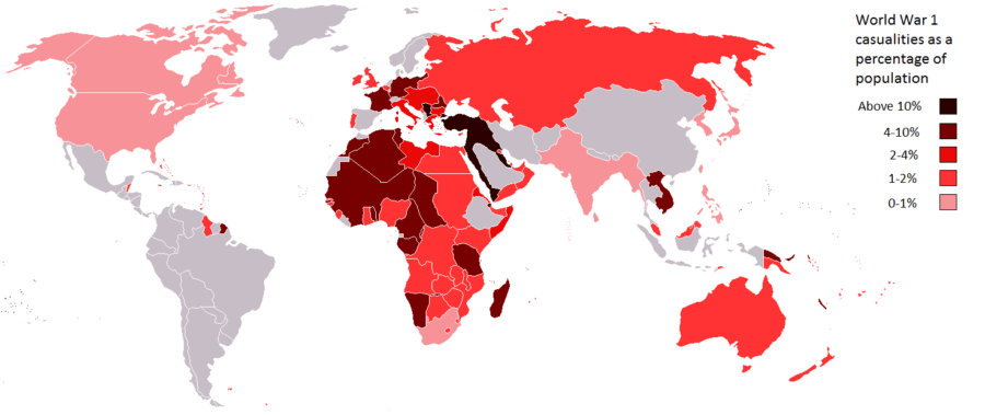
WWI Casualties Map
This map charts WWI casualties as a percentage of population. The lightest red countries saw casualties of under 1 percent of their population. The next two darkest shades represent 1 to 2 percent and 2 to 4 percent. Dark red countries saw 4 to 10 percent casualties, and the black represents countries with over 10 percent casualties. The map shows the devastating toll of the first world war.Lanson15/Reddit
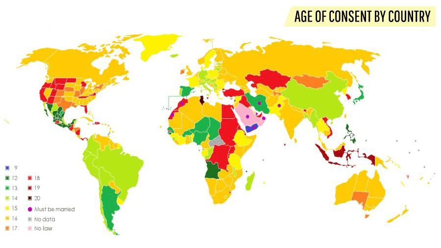
Age Of Consent World Map
Shockingly, some countries claim that children as young as 12 or 13 can consent to sex. Meanwhile, other countries define consenting adults as those who are at least 19 or 20 years old. Yet other places simply require people to be married before they have sex — and sometimes have no age limit at all.Wikimedia Commons
British Empire World Map
The empire reached its height in 1922, when it covered nearly a quarter of the world's land surface. The empire's legacy shapes modern politics into the 21st century. Cambridge University Library
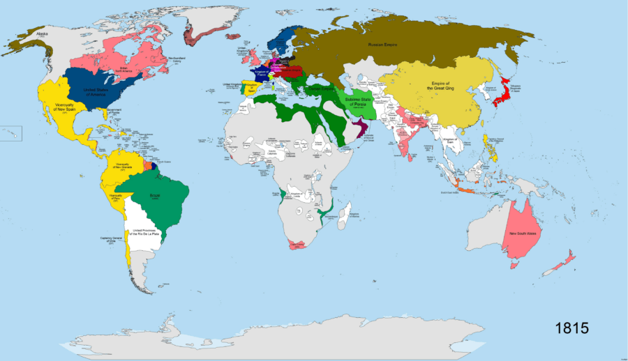
When The World's Population First Hit One Billion
This map shows the national boundaries of the world when the global population crossed the one billion mark during the early 19th century.
Some national borders look familiar. Much of Europe looks like a 21st-century map, and the borders of Russia and China are likewise very similar. But Africa and the Americas look quite different.SvoHljott/Wikimedia Commons
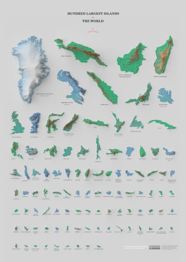
The World's Largest Islands
Greenland ranks at the top of the list. New Guinea, Madagascar, and Baffin Island also rank in the top 10. David Garcia
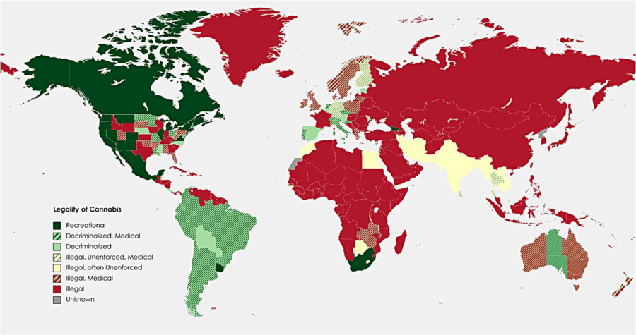
Marijuana Legalization World Map
For example, in the United States alone, some states have completely legalized cannabis, while others have only decriminalized it for medical use. Yet others have still maintained a complete ban on marijuana in all cases.Reddit
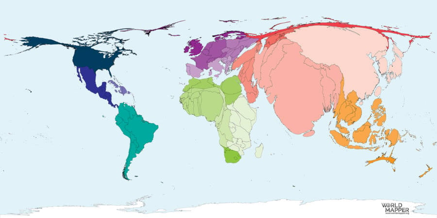
Weighted Population Map
This weighted population map shows what the Earth might look like if each country's physical size was proportional to its population.
When it comes to population, China and India rank at the top of the list. The U.S., Indonesia, and Pakistan rank behind them — looking quite small in comparison. WorldMapper
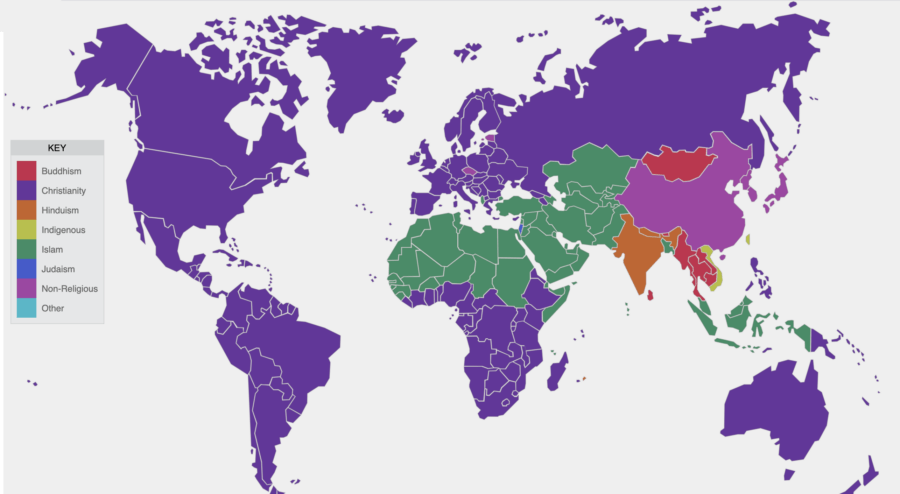
Religions Around The World
Charting dominant religions by country rather than by population, as this map does, gives another perspective on world religions. The dark purple areas represent predominantly Christian countries, while green represents predominantly Muslim countries and orange shows countries where most people practice Hinduism.
Red represents Buddhism, dark blue shows Judaism, yellow symbolizes Indigenous religions, and light purple indicates a lack of association with any religion.PBS


Which countries prefer tea over coffee? How many countries use the Gregorian calendar? And which countries saw the most casualties during World War I? These maps offer a unique perspective on our planet and its past. From the true size of Africa to the age of consent around the world, these are the maps that they didn't show you in school.
Maps can also help make complex truths much simpler. For example, a map of global ship traffic shows how much of the world trade is carried across the Earth's oceans — and how much pollution it causes. Crop coverage maps show where we grow most of the food that feeds our planet. And weighted population maps show where most of the world actually lives.
There's no question that more traditional maps — like the Mercator projection — remain popular to this day. But it's now known that some of the most famous illustrations of the world are misleading at best. That's why it's worthwhile to explore other maps and their striking revelations.
What did the world's national borders look like when the human population first hit one billion? How many countries still reject the metric system? And what would a 13,000-mile highway that stretches from New York to London look like? These 33 world maps are sure to change your perspective.
After looking through these unique maps, check out these maps that explain the United States. Then, travel back in time with these ancient world maps.